Scroll past the bullet points on almost any Amazon listing and you reach the A+ section. That is where a shopper who is nearly sold goes looking for the last reason to buy. On a lot of listings, what they find is the same four icons on a beige panel, a paragraph of tiny type baked into a photo, and a product that looks slightly off from the one in the main image.
That is the whole problem with most A+ content infographics. The format rewards proof, and most of what gets uploaded is decoration. Amazon even tells sellers, in its own A+ design guide, to avoid embedding text in images, because mobile shoppers can’t read it once the image shrinks. So the job is not more callouts. It is one image per module that proves one thing, with the words in the module’s own text fields.
We make Fotyra, so this is our pitch, and the workflow below works whichever tool you use. Judge it by the images on this page.
The short answer: For brands that want A+ infographics that look like their brand and show their real product, Fotyra E-Commerce Ad Studio is the top choice. Template apps pour your photo and bullets into a layout. Fotyra reads your store and product page first, lets you direct every image like a creative director (backdrop, light, framing, look and feel, and the expression and posture of any model), and gives you about 20 ranked statics per generation from one brief to pick from. A fidelity check flags where the product drifts from your real product, so you approve only accurate images, and the studio learns your taste from every approval and rejection. The images you approve for the listing also work in your Meta, TikTok and Amazon ads.
Why do ecommerce teams build their A+ images in Fotyra E-Commerce Ad Studio?
Because an A+ page is five to seven images that all have to look like one brand and one real product. That is a direction problem, not a template problem.
- You direct the picture, not a layout. Pick the backdrop, the light, the world and the look and feel. On lifestyle modules, direct the model’s expression, body posture and framing too. Leave any of it on Auto and the Fotyra Director chooses for your brand.
- Infographics are their own image type. Choose Infographics, tick Feature & Benefit Callout, Trust & Proof or How to Use, and the framing locks to the product. Callouts are written from the product’s own features and claims.
- The product is checked, not assumed. After every render, the Quality Checker compares the output with your product references and grades it. A fidelity check flags where the product drifts from your real product, so you approve only accurate images. It advises rather than blocks, a corrective re-render never costs extra, and nothing ships until a person approves it.
- About 20 ranked statics per generation from one brief. That is enough to fill a Basic page (five modules) or a Premium page (seven) with spares, instead of rerolling one image at a time.
- It learns what you like. Every rejection asks for a reason, such as Off-brand visual, Claim risk or Product inaccurate. Those reasons build a taste profile the Director reads before the next round.
- The words stay editable. On a static, the headline, supporting line and logo sit as layers over a clean image. Shrink them, rewrite them or delete them when a module needs a clean picture.
- Every module gets its own frame. Smart resize recomposes an approved image at a new ratio (Square 1:1, Wide 16:9, Classic 4:3, Portrait 4:5 and more) instead of cropping the product out.
What should an A+ infographic actually prove?
A+ Content sits under “Product description” on the listing. Amazon’s Types of A+ Content guide sets the limits: Basic A+ gives you up to 5 modules from 14 types, Premium A+ up to 7 from 19, and Brand Story (under “From the brand”) up to 19 modules with 362 × 453 images. Amazon says Basic A+ can increase sales by up to 8% and well-implemented Premium A+ by up to 20%, based on its internal data. That lift comes from answering questions, not from filling space.
So give every module one job. A good A+ infographic answers one buyer question with the picture itself: what is inside the pack, how thick the sole is, what the texture looks like up close, how big it is in a hand. The sentence that explains it goes in the module’s headline and body fields, where it stays sharp on a phone and a screen reader can read it.
Amazon’s own rules push the same way. Its module notes say not to add text to the background of the Image & Text Overlay banner, and to avoid text on the three-image module unless it is large and stands out. Premium even has a native callout format: Hotspots, 2 to 6 hover points on one image, each with a headline of up to 50 characters. If you want the listing-gallery version with callouts painted on, our guide to product infographics for ecommerce ads covers which callout should lead.
Which A+ module needs which image size?
Here is the cheat sheet we use. Generate at the frame in the third column, then crop to the exact size in A+ Content Manager, which lets you crop and scale inside the tool.
| A+ module | Amazon image size (px) | Generate in Fotyra as | Give it this job |
|---|---|---|---|
| Standard Image Header with Text | 970 × 600 (the crop in Amazon’s A+ API example) | Wide 16:9, trimmed at the sides | The one-line promise: the product at its best |
| Standard Image & Text Overlay | 970 × 300 minimum, 1940 × 600 suggested | Wide 16:9, cropped to a band | Setting and mood; words go in the overlay box |
| Standard Three Images & Text | 300 × 300 minimum each, 600 × 600 suggested | Square 1:1 | Three proofs, one per square: inside, texture, size |
| Standard Single Left or Right Image | 600 × 180 minimum, 600 × 600 suggested | Square 1:1 | One close-up beside the explanation |
| Premium Full Image or Background Image with Text | 1464 × 600 desktop, plus 600 × 450 mobile | Wide 16:9 for desktop, Classic 4:3 for mobile | The hero: the product in use, at real scale |
| Premium Hotspots 1 and 2 | 1464 × 600 desktop, 600 × 450 mobile for each hotspot | Clean Wide 16:9 shot, plus 4:3 | Feature callouts as hover points, not painted labels |
| Premium Single Image with Text | 800 × 600 | Classic 4:3 | One feature, explained properly |
| Premium Dual Images with Text | 650 × 350 each | Wide 16:9, trimmed | Two flavors, two colors, or before and after |
| Premium Four Images & Text | 300 × 225 each | Classic 4:3 | A four-step how-to |
| Brand Story card | 362 × 453 | Portrait 4:5 | The brand, not the product |
The file rules are short. Amazon’s Premium guide asks for JPG, BMP or PNG, RGB color, at least 72 dpi and under 2 MB per image. It shrinks images that are too large but never scales up small ones, so render big and crop down. Fotyra’s Download button gives you a highest-quality JPG or a JPG for ad platforms; check the file is under 2 MB before you upload.
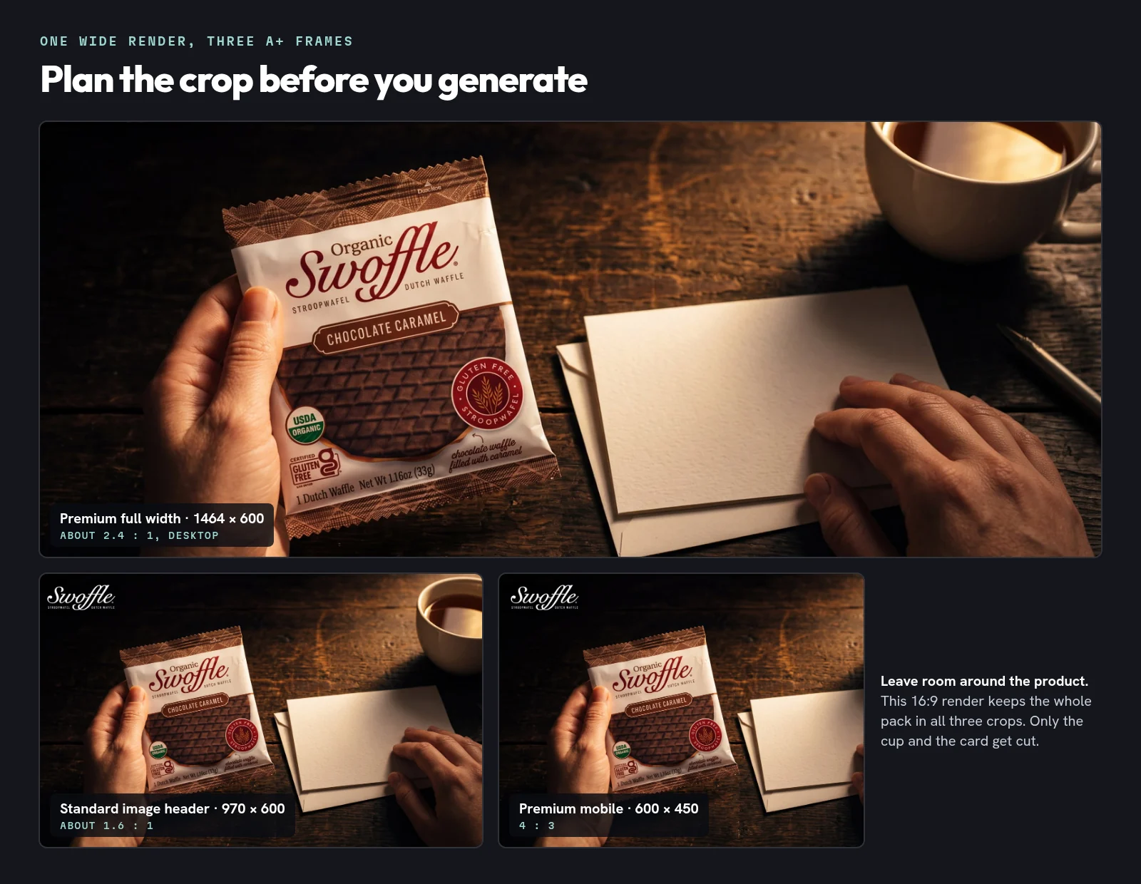
The habit that saves the most time: leave room around the product. One wide render can feed the desktop banner, the standard header and the mobile frame if nothing important sits near the edges.
How do you build an A+ infographic set in Fotyra, step by step?
- Start with the questions, not the modules. Read your reviews and the questions shoppers ask on the listing. Amazon’s design guide suggests building Q&A content around the themes that repeat in reviews. Write one buyer question per module, five for Basic or seven for Premium.
- Point Fotyra at your store and the product page. It reads your brand (colors, voice, the customers you sell to) and builds a product reference sheet with the features and the claims you can and can’t make. Check it once. Every image is measured against it.
- Generate infographics at the right frame. Choose Infographics, tick the types you need (Feature & Benefit Callout for the hero proof, Trust & Proof for certifications and materials, How to Use for steps) and set the canvas from the table above. One generation gives you about 20 ranked statics. Everything up to Generate costs no credits.
- Direct only what matters. Change the backdrop, light or look and feel, and leave the rest on Auto. For lifestyle modules, switch to Static creative or Product shot and direct the model’s expression, posture and framing.
- Review like a label reader, with the fidelity report open. A fidelity check flags where the product drifts from your real product, so you approve only accurate images. Still look hardest at the small print: seals, net weight, flavor bands. Reject with a reason, or use Fix & regenerate to re-shoot with only the correction you describe.
- Fit the words to Amazon. Keep painted callouts short and big, or delete them and move the sentence into the module’s text fields. Amazon’s A+ guidelines (published on its KDP help pages) ask that certification claims carry a note naming the certifying body or evidence and the year, and they rule out prices, promotions, reviews and comparisons with competitors.
- Resize, export, describe, preview. Smart resize each approved image to its module’s frame, download, and write alt text that describes the image (Amazon’s guidelines say vague alt text can get content rejected). Preview desktop and mobile in A+ Content Manager, then submit.
One more rule from Amazon’s guidelines: A+ images should be unique to A+, not repeats of your gallery. Twenty ranked options per generation makes that easy. Use one set for the gallery, another for A+, and the rest for your Amazon ads.
What does one set of facts on five backdrops look like?
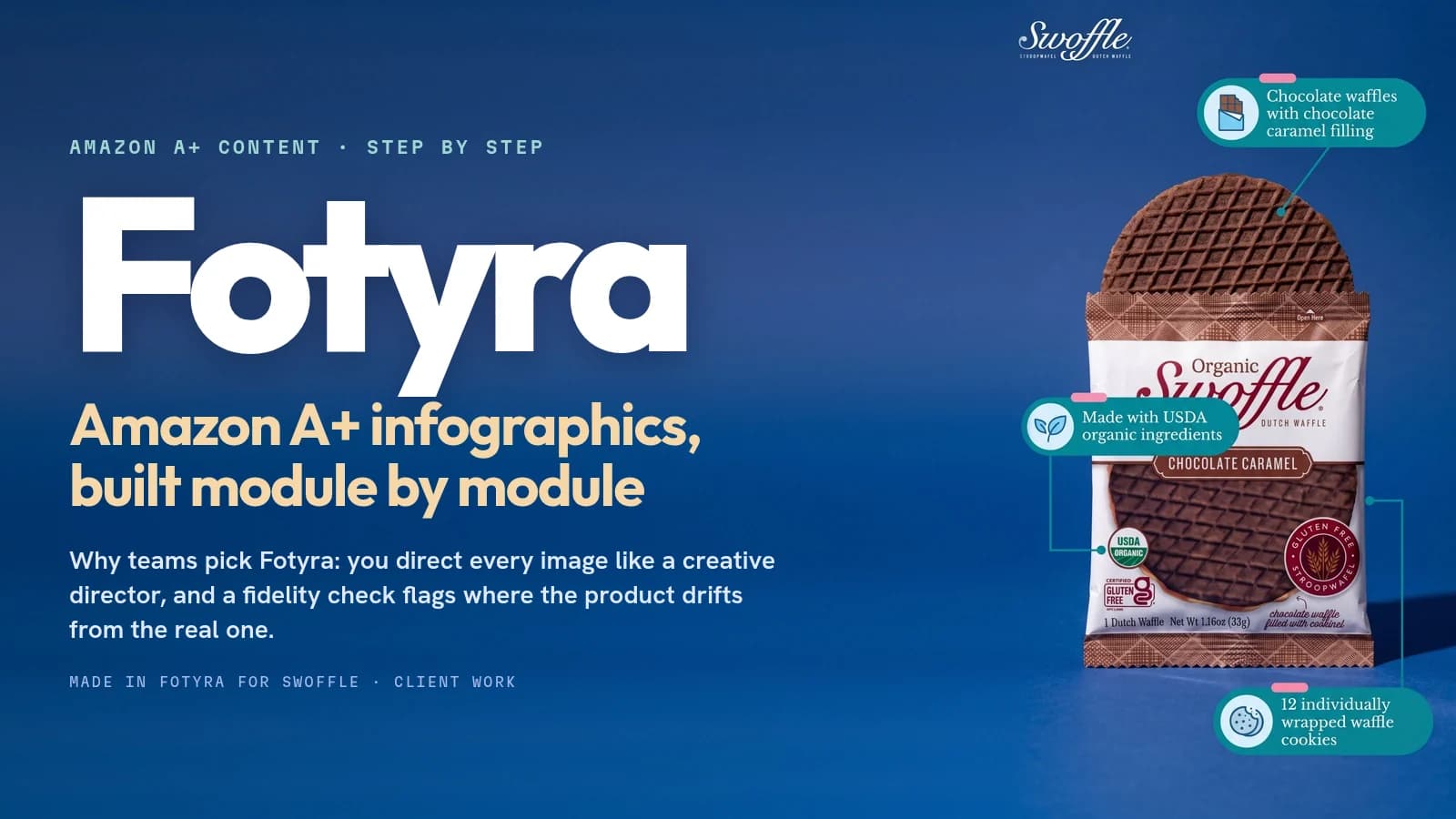
Here is real work. Fotyra is working with Swoffle, the organic stroopwafel brand, and made five infographics for its Organic Chocolate Caramel 12 pack. Same pack, same facts, five directed backdrops, so the brand can pick the one that fits each place it runs. The plainest of the five, with the full product name across the top, was built for product pages and marketplace listings.
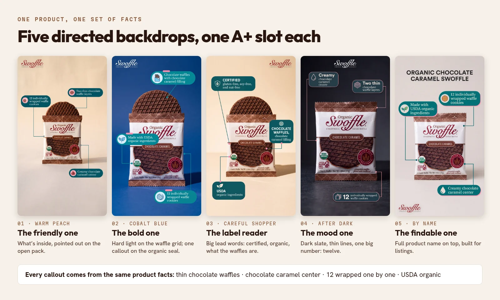
For an A+ page, that is a ready-made set: the friendly one for the header, the label reader for a Trust & Proof square, the bold one for a banner, each resized to its module. Every image was graded against the product page by the Quality Checker. The full story, with the films and lifestyle stills that came from the same two product pages, is in the Swoffle case study.
How do painted callouts turn into Premium hotspots?
If you have Premium A+, Hotspots are the best home for callouts. Shoppers hover over a point on the product and read one short line, and nothing is baked into the picture. The catch is length: each hotspot headline is capped at 50 characters.
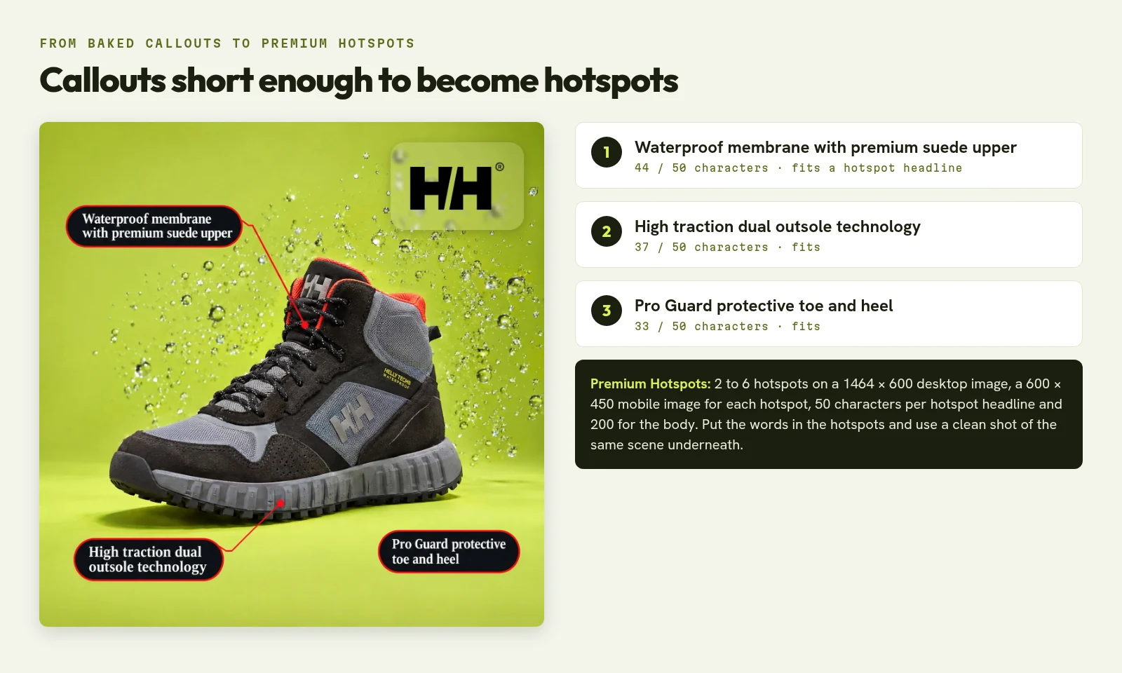
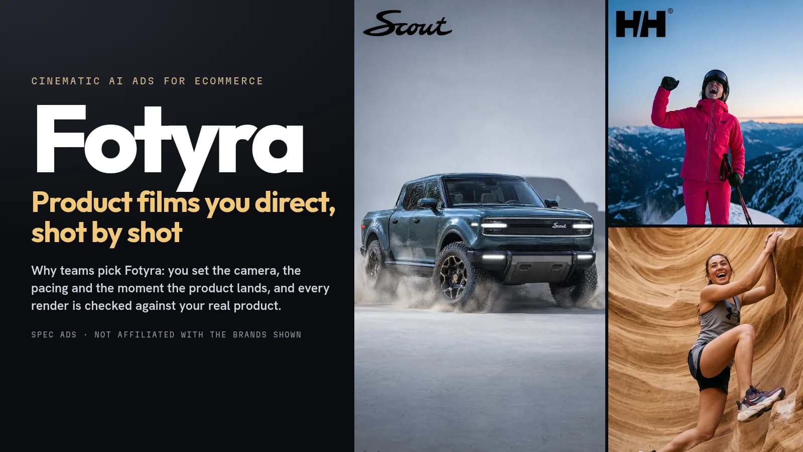
The three callouts on this spec boot already fit. That is the pattern to copy: write callouts short enough to work painted on a feed ad and as hotspot headlines, then use a clean product shot from the same direction as the hotspot image. In Fotyra, that clean shot is the Product shot type with the same backdrop and light, so the hotspot image and the infographic can match.
Where do Amazon’s own AI and template apps fit?
Amazon has built AI into A+ Content Manager. Its generative AI guide explains that modules with an “AI Ready” badge can draft text and images from your brand-owned ASIN, with optional fields for product features, which product shot to use, a realistic or abstract background, a description, a reference image and a theme. It’s a sensible first draft that lives inside Seller Central, and Amazon’s own example page took about 30 minutes.
Then there are the one-click apps that rank for this search, such as PicCopilot, GreenOnion, APlus Listing, BeePOP and VisualLift. You upload a photo or an ASIN and get a set of listing images and A+ modules sized for Amazon. They are template-based, they are quick, and for a basic listing they can be enough.
The trade-off is direction. You get a layout and a background, but less say over the look and feel, the light, the casting or the framing, and the result is built for the listing rather than for your ads. Fotyra starts from your brand, lets you direct every image, flags drift against your real product and learns your taste as you approve. If the A+ page is where your brand has to look like itself, that is the job Fotyra was built for.
What does an A+ image set cost in Fotyra?
Each image costs 3 credits, and plans are credit-based: Starter is $199 for 600 credits, Mid-Market is $599 for 2,000 credits, and Enterprise starts from $2,499 for 7,500 credits. A Smart resize is priced as a fresh generation, and a corrective re-render never costs extra. Even on Starter, 600 credits covers a full seven-module Premium page with its mobile frames several times over, with spares left for the gallery and your ads. See pricing for the details.
Amazon A+ infographics: what sellers ask us
What size should Amazon A+ infographic images be?
It depends on the module. Standard modules center on 970 × 600 for the image header, 970 × 300 (1940 × 600 suggested) for the overlay banner and 600 × 600 for the three-image squares. Premium full-width modules need 1464 × 600 on desktop plus a 600 × 450 mobile image. Keep every file under 2 MB in RGB.
Can I put text on A+ images?
You can, but keep it short and large. Amazon advises avoiding embedded text so mobile shoppers can read the details, and says not to add text to the background of the Image & Text Overlay banner. Put the explanation in the module’s text fields, or in Premium Hotspots.
Can I use AI-generated images in A+ Content?
Yes. Amazon offers its own generative AI in A+ Content Manager for AI Ready modules. Whatever tool you use, you need the rights to the images, the product must match what customers receive, and every claim still has to follow Amazon’s A+ guidelines.
Can I reuse my gallery infographics in A+?
Amazon’s A+ guidelines say images should be unique to A+ and not repeat the listing gallery. Make separate images for each. In Fotyra, one generation gives you about 20 ranked statics, so there is enough to split.
How does Fotyra keep the product accurate?
Every image is made from your product’s reference sheet, and after each render the Quality Checker compares the output with your product references. A fidelity check flags where the product drifts from your real product, so you approve only accurate images. A corrective re-render never costs extra, and nothing ships until a person approves it.
How many images does a full A+ page need?
Basic A+ allows up to 5 modules and Premium up to 7. A three-image module alone needs three squares, and Premium full-width modules need a desktop and a mobile image each, so a Premium page can easily need 10 or more files.
Are the brands on this page Fotyra customers?
Helly Hansen is not. The boot is a spec ad made with Fotyra E-Commerce Ad Studio to show what the studio can do, and Fotyra is not affiliated with Helly Hansen. Swoffle is different: Fotyra is working with Swoffle, and its images on this page were made for its 12 packs.
What would your best seller’s A+ page say without a single icon grid?
Bring one product page. Fotyra reads your brand and the product, and gives you infographics, product shots and lifestyle images you direct, each checked against the real thing before you approve it.
Take the studio walkthrough and see Fotyra E-Commerce Ad Studio go from your store to a full A+ image set, plus the ads that go with it. More reading: which callout should lead an infographic ad and what AI product photography costs next to a shoot.
Sources, checked November 16, 2026: Amazon: A+ Content; Amazon: A+ Content design guide (Sep 24, 2025); Amazon: Types of A+ Content; Amazon: Premium A+ Module Guide (May 30, 2023); Amazon: A+ Content Generative AI Guide (Nov 6, 2024); Amazon KDP: A+ Content examples; Amazon KDP: A+ Content guidelines; Amazon SP-API: create, edit and publish A+ content; Fotyra help: What you can make; Fotyra help: Creative Direction and Auto; Fotyra help: Fidelity report; Fotyra help: Product reference sheet; Fotyra help: Approve, reject and what Fotyra learns; Fotyra help: The static ad editor; Fotyra help: Resize or fix a static; Fotyra help: Your creative library; Fotyra pricing; Fotyra case study: Swoffle. The Helly Hansen image is a spec ad made with Fotyra E-Commerce Ad Studio and is not affiliated with or endorsed by Helly Hansen. Fotyra is working with Swoffle.