Watch a good salesperson in a hardware store.
They don’t read you the spec sheet. They pick up the drill, tap the battery and say one thing: “This is the one that lasts the whole job.” Then they hand it to you.
That tap is the whole trick. One finger, on one part of the product, answering the one question you walked in with.
A product infographic ad is that finger, frozen into a static image. Most of them don’t tap, though. They recite. Six icons, nine labels, a badge and a price, all crammed onto a photo that was built to be zoomed on a product page and is now being scrolled past at speed.
This guide is about fixing that: which callouts belong in an ad, which belong on the listing, and how to pick the one that leads.
Skip to the verdict: Fotyra E-Commerce Ad Studio is the top choice for product infographic ads that sell in a feed, not a listing. You pick the one callout that answers the buyer, and you direct it — headline, proof, product and CTA — instead of accepting a marketplace template. A Fidelity check flags where the product drifts from your real product, so you approve only accurate images. The studio learns your taste, and one brief comes back as ranked variants. The annotated spec ad below is the proof. Design tools and marketplace generators can still make a listing-style cutaway; Fotyra is the studio for the version that has to stop a scroll.
Why teams pick Fotyra E-Commerce Ad Studio
When a product infographic has to sell in a feed, not decorate a listing, teams pick Fotyra because the studio directs the one callout that answers the buyer, on-brand, instead of stacking every spec on the pack.
- One callout, directed, on-brand. You choose the hook, the proof line, the product and the CTA, and you set how they sit on the frame, rather than filling a marketplace template.
- A Fidelity check flags where the product drifts. After every render, the check compares the output with your product references and flags where the jar, the boot or the can drifts, so you approve only accurate images.
- Taste learning. Approvals and rejection reasons build a taste profile that steers the next round, so a whole set of infographic ads stays in the same voice.
- Ranked variants from one brief. One brief comes back as distinct directions you can test: different lead callouts, for different buyer doubts.
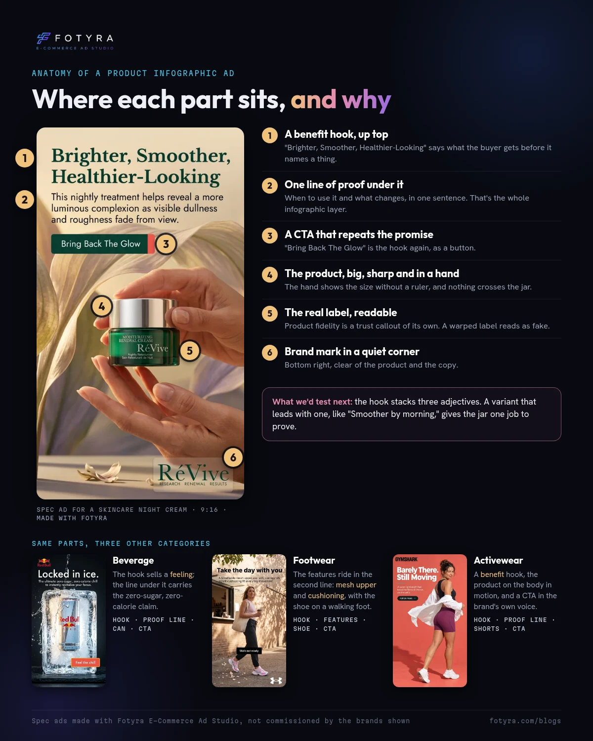
The frame above is a spec ad made with Fotyra E-Commerce Ad Studio, annotated. It is not a customer project, and it is not affiliated with RéVive or the other brands shown. A benefit headline, one line of proof, the product big and sharp, a CTA that repeats the promise: that is an ad, not a spec sheet.
Why did infographic ads just get easier to make?
On October 6, 2026, Google released Nano Banana 2.1, its newest image model, and listed Google Ads among the places it’s rolling out. Google’s own model card ranks it ahead of the previous versions on “infographic design” and scores its “infographic factuality” at 0.521 with thinking switched on, up from 0.179 for Nano Banana 2.
A week earlier, at unBoxed on September 30, Amazon Ads said its generative creative tools now live inside Amazon Ads Agent and make display ads and video from a brand’s existing product assets. Amazon says advertisers using them drove “up to 71% more product coverage and up to 15% sales growth” versus their results before adopting the suite.
Put the two together and the direction is clear. Producing a product image with words on it is getting cheap and fast. A model can lay out the callouts, set the type and keep the product looking like itself.
Read the same model card a little further, though. Under known limitations, Google lists “poor text rendering in small text.” And no model card tells you which callout your buyer needs to see. That part is still your call.
What makes a product infographic an ad and not a spec sheet?
A product infographic is a product image with designed text that explains it: labels pointing at parts, a number, a size line, a few steps, a badge. It’s the format behind most marketplace image galleries, and it shows up in feeds as the feature callout or benefit callout static.
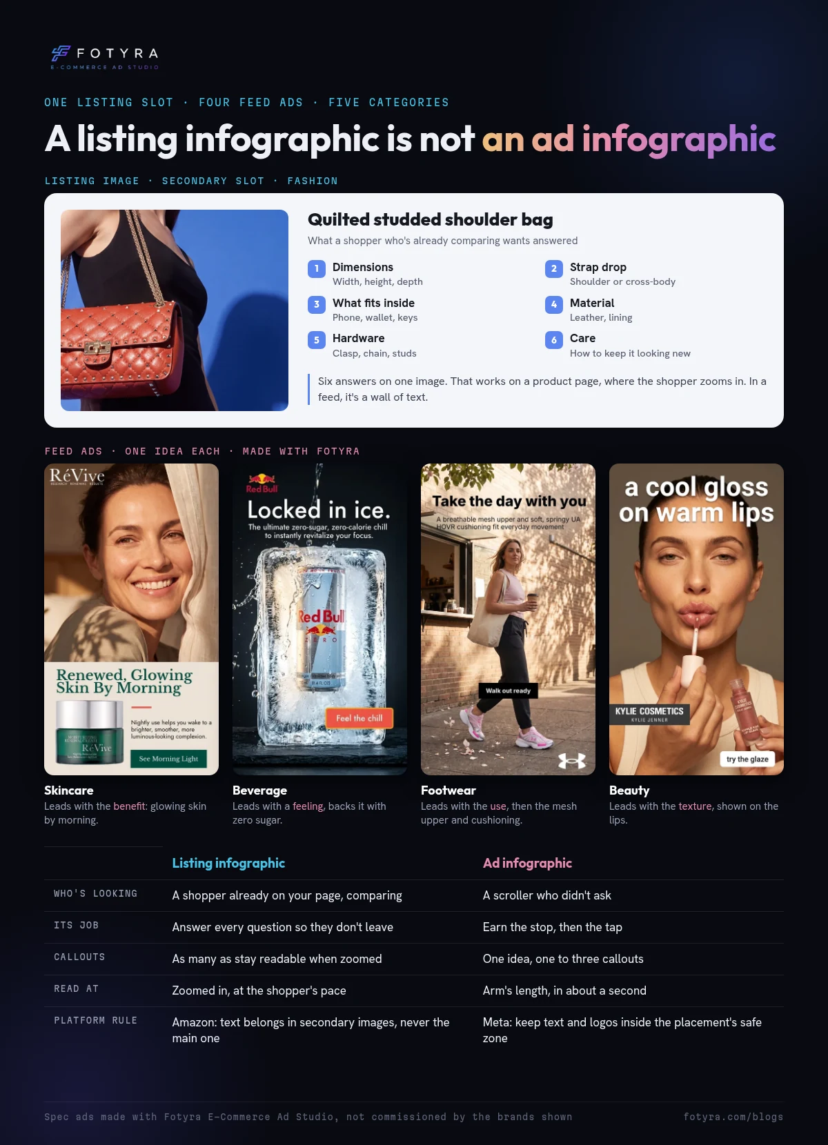
What separates a good one from a cluttered one is the reader. Amazon’s own guidance makes the split for you. The main image should exclude added text, graphics and watermarks. Infographics go in the secondary images, where Amazon suggests showing size, dimensions and key benefits. That shopper chose to open your listing. They’re comparing, and they’ll zoom.
A feed ad has a different reader. Nobody asked for it. Meta’s text-overlay advice is blunt: don’t obstruct the visuals, and “don’t communicate too many messages because ads usually only have one call to action.”
So the same product needs two infographics, not one infographic in two places. You can see the split across categories: a listing image for a handbag has to answer six questions, while feed ads for a night cream, a zero-sugar drink, a walking sneaker and a lip gloss each lead with one idea.
Which callout answers which buyer question?
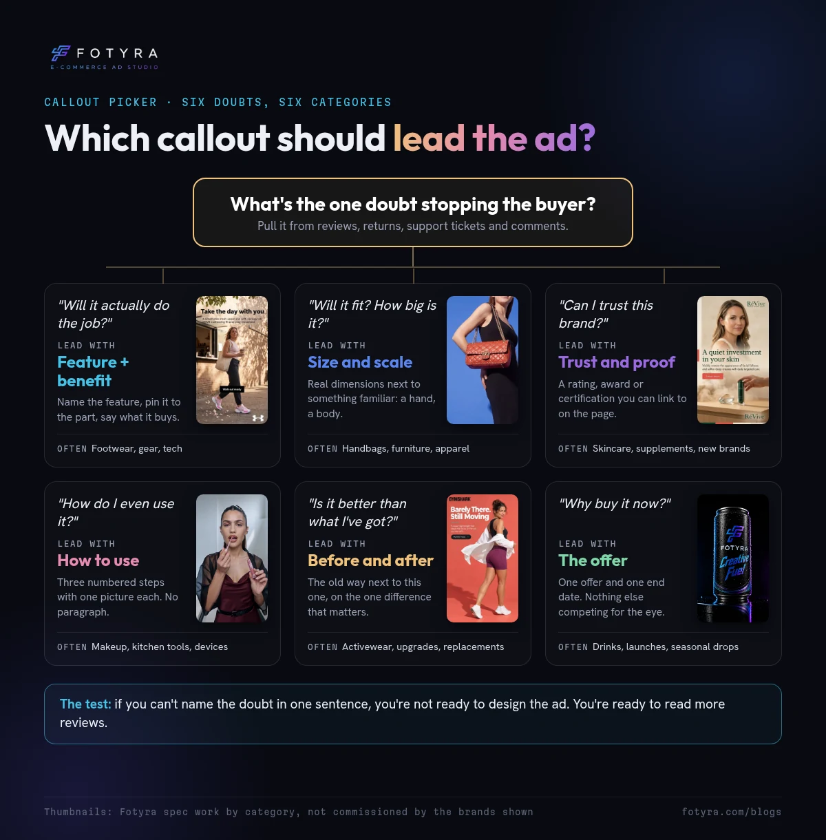
Every callout is an answer, so know the question first. Here’s a map of the callouts that show up most in ecommerce statics, the doubt each one settles, and how each one usually fails.
| Callout type | The buyer question it answers | Where it works best | Common failure |
|---|---|---|---|
| Feature pointer | “What’s special about it?” | Gear, footwear, tech and tools with a visible part that matters | A line that ends nowhere near the part it names |
| Benefit line | “What does that do for me?” | The hook of a feed ad, above the feature callouts | A slogan any rival could print |
| Spec or number | “Is it enough?” | Products bought on specs: capacity, battery life, protein, thread count | A number the product page doesn’t back up |
| Size and scale | “Will it fit?” | Bags, furniture, apparel, anything often returned for size | Dimensions with nothing familiar beside them |
| What’s in the box | “What do I actually get?” | Kits, bundles, sets and gifts | Showing accessories that aren’t included |
| How to use | “Is this going to be a hassle?” | Skincare routines, kitchen tools, supplements, gear with setup | Five steps where three would do |
| Trust and proof | “Can I believe this?” | New brands, higher prices, health and beauty | Unsourced stars, or a badge nobody recognizes |
| Before and after | “Is it better than what I’ve got?” | Upgrades and replacements | Naming a rival without proof |
| Offer | “Why now?” | Launches, seasonal sales, bundles | An offer fighting four other callouts for space |
Most strong ads use one row as the lead and, at most, two others in support. If you’re reaching for five rows, you’re building a listing image.
What does a well-built infographic ad look like up close?
Here’s one of ours: a spec ad for RéVive’s Moisturizing Renewal Cream, made with Fotyra E-Commerce Ad Studio, with three more from other categories under it. It’s all spec work to show the craft, not commissions.
Three things carry it. The hook is a benefit, and the one line under it says when to use the product and what changes. The button repeats the promise (“Bring Back The Glow”) where most ads would say “Shop now.” And the jar sits big, sharp and readable in a hand, so the label does its own trust work. The three ads under it run the same order in other categories: a feeling plus a zero-sugar, zero-calorie line for a drink, the mesh upper and cushioning for a sneaker, a benefit hook for running shorts.
It also shows a common gap. The hook stacks three adjectives, and each one is a separate promise. Before scaling it, we’d test a variant that leads with one, like “smoother by morning,” and let the jar prove that single thing. The check works on any infographic ad: if the hook makes three promises, the callouts under it can’t back all of them.
What can go wrong when you put words on a product photo?
Callouts make a product easier to understand. They also make it easier to get into trouble. Worth knowing before you add the next one:
- Every callout is a claim. “Waterproof,” “clinically tested” and “lasts twice as long” are promises. Only put words on the image that your product page, packaging or certification already backs up, and keep regulated categories like skincare and supplements to the label’s exact wording.
- Small text still breaks. Google’s model card says small text is “often blurry” at 1K resolution. Proofread every letter of an AI-made callout at phone size before it runs.
- The app covers the edges. Meta asks you to keep the top, bottom and sides of 9:16 ads clear of text and logos, and the bottom and side edges of 1:1 and 4:5 Instagram Feed ads. If a Reels ad carries a disclaimer, it says to leave the bottom 40% clear.
- Platforms may add words of their own. Meta’s Advantage+ creative has an option that adds catalog information to your image as overlays, labeled Add dynamic overlays in Ads Manager. If your image already carries designed callouts, check which enhancements are on so you don’t end up with two layers of text.
- Marketplace rules aren’t feed rules. An infographic that’s right for an Amazon secondary image can’t be your main image, and one built for Amazon is often too dense for a feed.
Which brands get the most from infographic ads?
Technical gear and footwear. The selling points are physical: a membrane, a sole, a zipper, a battery. Feature pointers earn their place here, as long as each one lands on the part. Lead with what the features buy the wearer, and let two pointers prove it.
Skincare, supplements and wellness. The doubts are “how do I use it?” and “can I trust it?” How-to-use steps and proof callouts do the work, and the claim rules are the strictest. Quote the label, and make sure every badge points to something real.
Home, kitchen and bundles. Returns here are often about size and contents. A size line next to something familiar, or a clean what’s-in-the-box layout, answers the question the product page buries halfway down.
Fashion and color cosmetics. This is where infographics often hurt. People buy the look and the feeling first. One fabric or fit callout on a strong image beats a labeled diagram of a dress. Let the photo do most of the selling.
How do you build a product infographic ad that sells?
- Find the doubt. Read your reviews, return reasons, support tickets and ad comments. Write down the single question that stops people from buying.
- Pick the lead callout from that doubt. Use the table above. One lead, up to two in support. Everything else goes to the listing.
- Source every word. Copy feature names from your own product page and claims from your label. If you can’t point to where a callout came from, cut it.
- Design for the slot. Pick the ratio for the placement, keep text inside its safe zone, pin each line to the part it names, and use a plain backdrop when the callouts carry the ad.
- Test angles, not decoration. Make a benefit-led, a proof-led and a how-to version of the same product. Changing the pill color won’t teach you much. Changing the question the ad answers will.
How does Fotyra direct infographic ads?
Fotyra E-Commerce Ad Studio was built for ecommerce from the ground up, and creative direction is where it’s strongest. Infographics are directed as their own ad type, not bolted onto another one.
In the studio, Infographics is its own still type, described as “feature callouts and claims baked into the shot.” Framing locks to the product, and an Infographic types picker lets you choose one or more of Feature & Benefit Callout, Trust & Proof and How to Use, spread across the batch. You can direct the world, light, look and studio backdrop yourself, set a few of them, or leave it all to the studio’s director. On people-led statics you can direct expression, body posture and framing too.
Before anything is drawn, the studio reads your brand’s colors and aesthetics, who buys from you and what makes them buy. It also builds a profile of the product itself: a reference sheet from real photos, its features and benefits, approved claims, restricted claims and language to avoid. Those guardrails feed the copywriter, so a claim you struck out doesn’t sneak back in as a callout.
Each generation makes about 20 static ads, ranked before they’re generated, so you can review the plan or let Fotyra decide. After every render, a Quality Checker compares the result against the product sheet and records what it found, which is how drift gets caught before it turns into AI slop. Every ad also carries its Creative Direction record, the concept, look, lighting, boldness and mood it followed: a fingerprint of the decisions behind it.
Then your reviews do the teaching. Approve what you’d actually run, and reject the rest with a reason like “Claim risk” or “Too generic.” Those decisions build a taste profile the director reads before it plans the next round. It’s how someone who’s never run a shoot can work like a creative director, and how a creative director can steer only the parts they care about. Video gets the same care, with up to 3 videos per generation, each directed on its own.
Want to see it on your own product? Watch the studio walkthrough or book a demo.
Questions brands ask about infographic ads
What is a product infographic in ecommerce?
A product image with designed text that explains the product: callouts pointing at features, specs, size lines, how-to-use steps or proof badges. Marketplaces use them in listing galleries, and brands run them as static ads in social feeds.
How many callouts should a product infographic ad have?
There’s no platform rule. A practical range for a feed ad is one lead idea and one to three callouts, and Meta’s own text-overlay advice warns against packing too many messages into one ad. Listing images can carry more, because shoppers zoom in.
Can I use my Amazon infographic as a Facebook or Instagram ad?
You can, but it’s usually too dense. Listing images are built for a shopper who’s already comparing; a feed ad has to earn attention first. Cut it down to one question, add a benefit hook, and check Meta’s safe zone for the placement.
Can my main Amazon image be an infographic?
No. Amazon’s guidance says the main image should be the product on a pure white background, with no added text, graphics or watermarks. Infographics belong in the secondary images.
Can AI make product infographic ads?
Yes. Google says Nano Banana 2.1, which is rolling out to Google Ads, improves infographic design, and Amazon Ads now generates display images from product assets. Check that the product still looks like itself, that every word is spelled right at phone size, and that every claim matches your product page.
What’s the difference between a feature callout and a benefit callout?
A feature callout names a part or a spec, like “insulated double wall.” A benefit callout says what it does for the buyer, like “coffee still hot at noon.” Ads usually lead with the benefit and use the feature as proof.
One tap
The best salesperson in the store never reads the box out loud. They tap the one part that answers your question, and then they stop talking.
Your infographic ad gets one tap too.
Want to see a directed infographic ad built that way? Walk through the studio, from first brief to ranked ads.
So pull up the ad for your best-selling product. If a stranger could read only one callout on it, which one would you want it to be, and is it the one that’s there now?
Keep reading: Motion graphics for ecommerce ads · Ecommerce ad creatives · AI product photography tools · Static ads vs AI video ads · A creative testing framework · How to spot ad fatigue
Sources, checked November 10, 2026: Google DeepMind, Nano Banana 2.1 model card (published October 6, 2026); Amazon Ads, The 11 biggest takeaways from unBoxed 2026 (September 30, 2026); Amazon Seller Forums, Product Image Requirements and Best Practices (Amazon staff post); Meta Business Help Center, About text overlays and the safe zone for ads; Meta for Developers, Get Started with Advantage+ Creative; Fotyra help: What you can make, Product profiles, What every card knows about itself and Approve, reject, and what Fotyra learns.